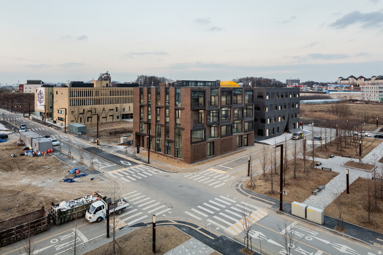
-
Architects: poly.m.ur
- Area: 2503 m²
- Year: 2017
-
Photographs:KyungsubShin
-
Lead Architects: Homin Kim

Text description provided by the architects. Zip Cinema is a premier film studio in Korea known for an extensive list of blockbuster titles such as Jeon Woochi :The Taoist Wizard (2009), Cold Eyes (2013), and The Priests (2015) and they were working on a plan to build a new headquarters. First meeting with the client took off amicably as both parties were committed to the same goal: zip, which is the name of the studio and also means ‘house’ in Korean. However, decision by Zip Cinema, a studio that produced 10 movies in the last 10 years, to partner with a relatively new architecture firm with a decade of history may have been somewhat unexpected at first. Moving away from Gangnam, major commercial area of Seoul, and relocate its headquarter to Paju, Gyeonggi-do was a daring move for an up-and-coming movie studio.


Movie industry has come to forge a strong tie with the corporate world, especially finance industry, as its dependency on capital and distribution became an integral aspect of success. Majority of movie studios have established their headquarters in Gangnam despite a long list of adversities such as high rent, tight parking space, and unimaginative office layout, because they had to stay close to their financial and marketing partners. President of Zip Cinema, Eugene Lee, made an executive decision to go against the grain and find a new home away from Seoul in Paju Publishing Complex, because she knows all about taking risks building career in an industry dominated by men. Most importantly, she wanted to recognize and reward her staffs with an environment that appreciated and motivated creativity, because their dedication and commitment was an integral part of the studio’s success.


In addition to the background, actual needs of the movie studio were carefully considered as the design process began. First main area of business involved meetings and lots of them for working on scenarios and brain-storming sessions. The other main business was, of course, producing and releasing movies. For these two purposes, 2 separate multi-purpose halls were placed on each side of the building. Spaciousness of the halls that extends 2 stories creates refreshing sense of openness when not in use, but it is fully utilized for as premiers, publicity events, or backdrop for cast interview when movie release is scheduled.

For the nature of the business that requires constant exposure to the media, it is a necessary and integral space that fully addressed their needs. Besides, openness and spaciousness free from the requirement of floor area ratio was also the very reason behind the client’s move away from densely populated Seoul. Zip Cinema in Paju is designed to feature 4 stories measuring 15 meters in height, maximum allowed by regulation. Cafe and multi-purpose hall were placed on the 1st floor to welcome visitors, but the café was designed to be slightly submerged, 1 meter, as a sunken space except the main corridor. As studio staffs have meetings with screenwriters or host visitors at the café, lowered sightline from the sunken position creates coziness and security. Extended ceiling height is a welcome side effect. Multi-purpose hall adjacent to the café is designed to facilitate various events for a large group of people involving movie releases such as premiers and interviews.


Meanwhile, floors above the 1st floor were reserved exclusively for the studio personnel such as staffs and screenwriters. Multi-purpose hall on the east wing is located on the 2nd floor with ceiling opened all the way to the 3rd floor to be used by staffs taking a break to relax or stretch. Openness of the space also makes it a perfect venue for the studio’s weekly meeting attended by all staffs. Office space was designed according to the orientation for the greatest efficiency and effectiveness. For example, west-facing offices were designed to block out blazing afternoon sun with tall and narrow walls covering more than half of the facade. The walls worked like louvers and its angular orientation effectively controlled the sunlight streaming inside. Offices facing the north and south stuck to the overall design concept for consistency and effortless look. Spatial element that best symbolized Zip Cinema was incorporated to the south elevation.

It is human nature to prefer space that is deemed to be appropriate in its scale. That’s why you see people favoring corners and cozy spaces rather than wide open ballrooms. Engaging in water cooler conversations in the office pantry or stair landing is an integral part of corporate life for the same reason. To that end, a concept of ‘micro’ space was adopted for the southern elevation. Unlike a room that is identified by walls, a space was created by converging the balcony on the outside with the corner in the inside. Cozy and relaxing atmosphere of the space helps staffs seek refuge from stress and pressure away from their work stations while they take a coffee break or engage in a friendly conversation. Part of the 4th floor is planned exclusively for screenwriter featuring a shower stall, kitchen, and dormitory so that their creative mind could live and work in the headquarters. If they need a break or get some fresh air, they can easily walk up to the rooftop where there is a rest area.


